
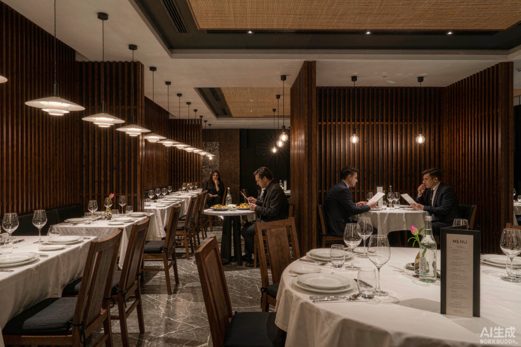
Colour selection in acoustic work usually happens late, in a hurry, from a fan deck. That is a mistake, because acoustic panels are rarely small: a treated wall may cover thirty or fifty square metres, a baffle field may fill a ceiling, and a screen system may define an entire floor plate. At that scale, colour stops being a finish decision and becomes an architectural one — it sets the light level of a room, signals where zones begin, and determines whether a space reads as calm or busy.
Why large areas behave differently
A colour chip the size of a thumbnail is judged against white paper and daylight. The same colour on fifty square metres is judged against the room’s lighting, the adjacent materials, and the viewer’s adaptation over time. Three effects follow. Saturated colours intensify at scale, so a chip that looks cheerful becomes overwhelming on a wall. Dark colours absorb light and make a room feel smaller and quieter, which can be desirable in a cinema lobby and unwelcome in a classroom. And texture interacts with colour: felt’s matte surface diffuses light, so a mid-tone reads flatter and more even than the same tone in a gloss finish.
The practical rule is to test at scale, in place. A physical sample of at least A3 size, pinned to the wall and viewed at three times of day, tells you more than any render. Designers who skip this step are the ones who specify a colour that is technically correct and experientially wrong.
Colour as zoning and wayfinding
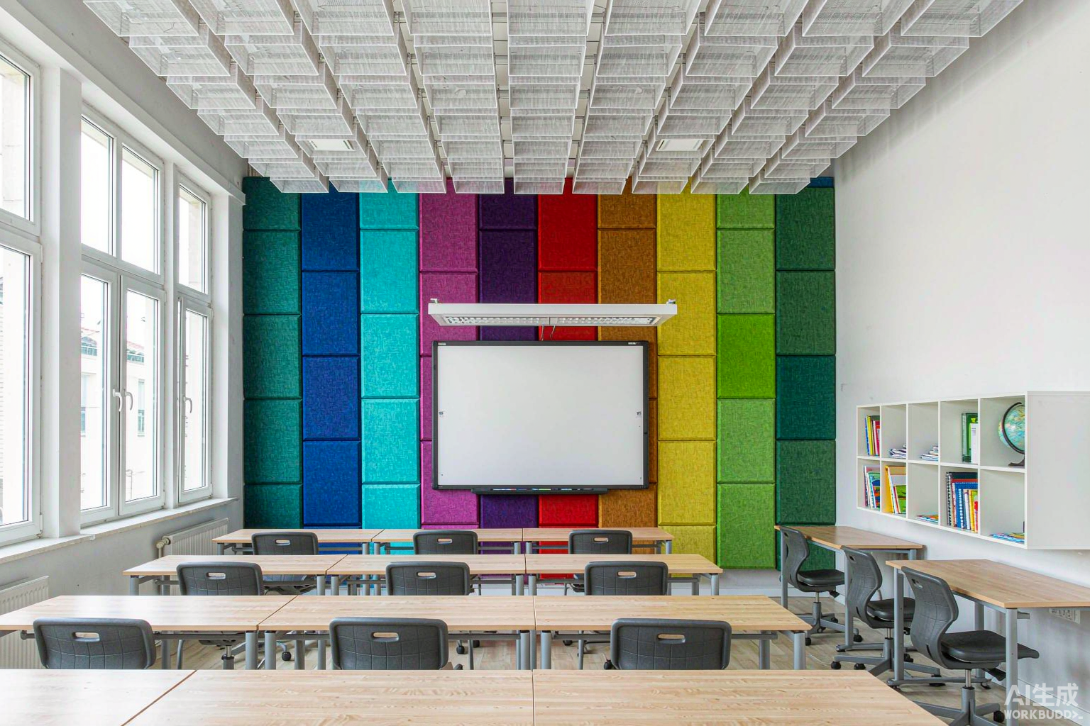
In offices, schools, and healthcare buildings, colour is the cheapest wayfinding system available. A consistent colour per zone — blue for focus rooms, green for collaboration, warm neutrals for circulation — allows people to navigate without signage and reinforces the acoustic logic of the plan, because the treated surfaces are already defining where each zone begins. The key is consistency of hue and a limited palette: three or four colours used systematically reads as designed; eight colours used decoratively reads as noise.
Contrast matters more than hue for accessibility. Wayfinding colour should differ from its background in tone as well as in hue, so that it remains legible for people with colour vision deficiency. A dark panel on a light wall works for everyone; a red panel on a green wall does not.
Perceived acoustics and perceived warmth
There is a reliable psychological effect worth exploiting: warm, dark, textured surfaces make a room feel acoustically softer even before any measurement, while pale, cool, hard surfaces make the same room feel reverberant. In spaces where the acoustic treatment is limited by budget, using warmer tones and more texture on the treated areas increases the perceived improvement — not the measured one, but the one occupants report. Conversely, in a room that is already heavily treated, warm colour prevents the over-damped, clinical feel that full absorption can produce.
This is not an argument for deceiving clients; it is an argument for aligning visual and acoustic messages, so a quiet room looks quiet. Rooms where the two disagree — a heavily treated space that still looks hard, or a reflective space that looks soft — generate dissatisfaction that no measurement explains.
Lighting, sheen and the third variable
Colour is never seen alone. The same felt in three lighting conditions reads as three colours: warm 2700 K lighting pushes greys toward beige, cool 4000 K pushes them toward blue, and daylight shifts throughout the day. In spaces with feature lighting — grazing wall washers, linear pendants, coloured accents — the panel colour will be modified by the light, and the specification should consider the pair rather than the panel alone.
Sheen matters too. All matte finishes reduce the sparkle that makes a colour feel alive, which is an advantage in large areas and a limitation on feature walls where depth is wanted. Where a project needs both, a mix works: matte felt for the field, a satin wood slat element for the focal point, with the two colours chosen together.
A working method for colour at scale
Five steps produce reliable results. Establish the room’s light level target first — light, mid, or dark — and choose a value band accordingly. Select a palette of three to four hues tied to zones or functions. Test A3 samples in place, at the project’s lighting, over two days. Check contrast for wayfinding legibility. And archive the approved sample with the batch reference so future phases and replacements match.
The last step is the one that protects the investment. Colour consistency across phases, floors, and years is what separates a designed interior from a patchwork, and it depends on a physical reference that outlasts the project team. A supplier who keeps that archive — and who can reproduce it years later — is worth more to a client than one who offers a wider palette today.
Palette discipline across a building
A single building with four floors and a dozen acoustic surfaces can easily acquire nine colours, because each space is designed in isolation. The result is not variety but incoherence, and it undermines the wayfinding benefit that colour could have delivered. The discipline that prevents it is a building-wide palette of three to five hues, each assigned a meaning, with value variation used for differentiation within a hue rather than new colours.
This is more practical than it sounds. A palette of a deep teal, a warm grey, a sand, and a charcoal, each available in three values, produces twelve combinations from four pigments — enough for every floor and every zone without ever introducing a colour that does not belong. Manufacturers who offer a systematic value range within each hue make this easy; those who offer a mixture of unrelated tones make it hard, and the difference shows in the finished building.
The palette should also survive replacement. When a panel is damaged or a phase is added two years later, the new material must match. That means the palette has to be documented with physical references, batch records, and a nominated owner inside the client organisation — usually the facilities or estates team rather than the original design team, who will have moved on.
For distributors, the palette conversation is an opportunity to sell more than panels: a documented colour schedule, retained samples, and a re-order guarantee turn a one-off supply into a continuing relationship. Buildings change, phases get added, and the supplier who can reproduce a colour from four years ago is the supplier who gets the call.
Key Takeaways
- At wall or ceiling scale, colour sets the light level of a room before it reads as a palette choice.
- Test A3 samples in place, under the project’s lighting, at three times of day — never judge from a chip or a render.
- Use three to four hues systematically for zoning and wayfinding, with value variation for differentiation instead of new colours.
- Check tonal as well as hue contrast so wayfinding remains legible for colour vision deficiency.
- Document the palette with physical references and a named owner so phase two and replacements still match.
Colour consistency across phases, floors and years is what separates a designed interior from a patchwork. It depends on an archive that outlasts the project team, which is why the supplier who can reproduce a shade from four years ago is worth more than one offering a wider palette today.