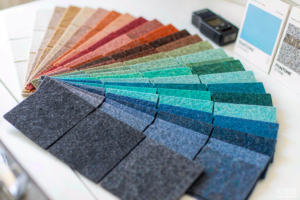
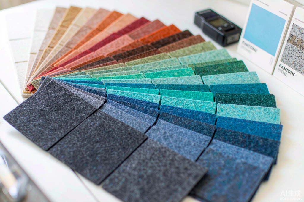
Every corporate fit-out arrives with a brand book, and every brand book has a color the designer wants on the wall. Standard catalog colors cover most rooms — but the projects that define a distributor’s year are the ones that demand exact color: the telecom company’s teal, the hotel group’s terracotta, the university’s deep blue. Matching those colors in PET acoustic felt is a manufacturing discipline most factories talk about and few industrialize. This is how it actually works at MST, from Pantone number to loaded container.
Step one: the lab match
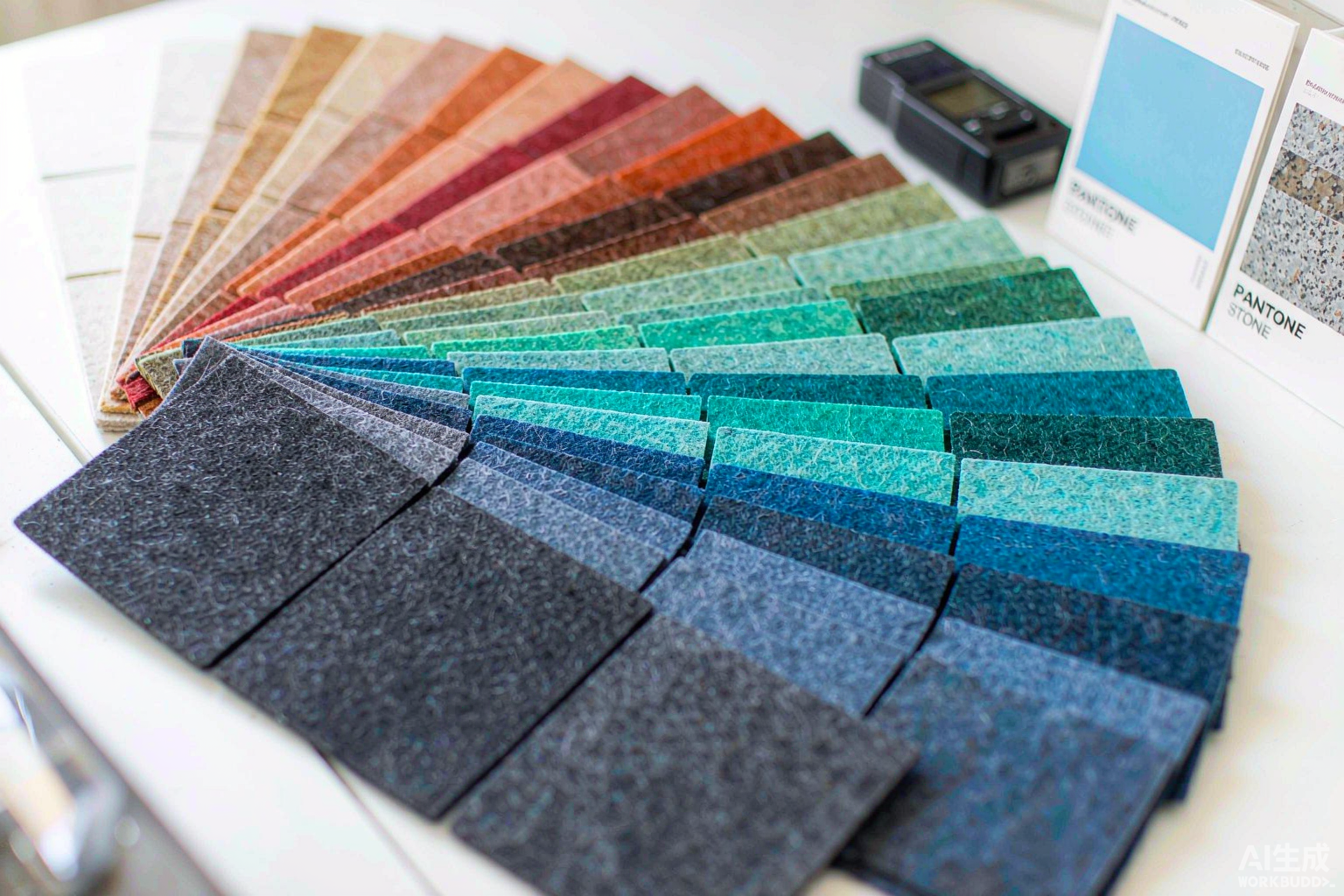
A color program starts with the target — a Pantone reference, a physical swatch, or sometimes a photograph the client insists is “close enough” (it rarely is). The felt production team’s first job is translating that target into a fiber recipe: pigment masterbatch selection, blend ratios and process temperatures, because the same pigment behaves differently at different felt densities. Lab-scale felts are produced and compared under standardized daylight lighting against the target — and, crucially, against the Pantone chip in both “coated” and “uncoated” versions, because designers mean one of them specifically and the difference is real.
Step two: the approval loop
Lab samples ship to the customer with two documents: a spectrophotometer reading (CIELAB values and ΔE against the target) and plain-language notes on how the color will behave at production scale. The customer — often the end client’s brand guardian — approves, adjusts, or requests another turn of the loop. Two or three rounds are normal; the discipline of written color values at every step is what prevents the classic failure of “it looked right in the showroom and wrong on site”.
Step three: production discipline
An approved color enters production under rules that protect it: dye-lot logging so every production run of that color is traceable; retained samples archived in the factory’s reference library for future reorders; and spectrophotometer checks through the run, because pigment drift over a long production day is real and only instrumentation catches it early. For OEM partners, the approved color and its records become part of the brand’s product identity — a reorder two years later matches because the recipe and the reference both still exist.

What custom color realistically costs
Honest guidance serves partners better than a one-line “yes”. Custom colors add a sampling phase (one to two weeks per loop) and a minimum run sized to the pigment changeover economics — smaller than most buyers fear, larger than a sample order. The economics improve when brands consolidate: one custom color across multiple product families (wall panels, baffles, screens) in one production window amortizes the setup across the whole program. And the payoff is structural: a distributor who can deliver a brand’s exact color becomes that brand’s default acoustic supplier, because matching is the capability competitors cannot quickly copy.
Start with a swatch
The entry ticket to a color program is simple: send the Pantone number or physical swatch, the product families and target volumes, and the MST team will return a feasibility note, sampling timeline and MOQ structure within days. Colors are the most emotional specification decision in interiors — and the one where manufacturing discipline shows most. That is why we treat every brand color like a production standard: measured, archived, and repeatable, year after year.
The Matching Process, Step by Step
A custom colour job begins with the reference – a Pantone number, a physical sample, a fabric swatch, or sometimes a photograph with honest lighting. The lab’s first question is always the same: what will this colour be seen against, and under what light? Fibre colour behaves differently from paint; the same dye lot reads lighter in thick felt than thin, and metamerism can match a sample in daylight while drifting under warm LEDs. So the lab produces trial swatches in the actual production thickness, measures them with the spectrophotometer, and evaluates under the project’s relevant light sources before anything ships. The client approves a physical swatch – never a screen – and that approved sample becomes the archived standard.
Production then locks the colour in writing. The batch record carries the dye formulation, fibre blend, and pressing parameters; the archived swatch sits in the sample library against the project code; and every subsequent order for that colour is verified against the standard before dispatch. Minimum quantities for custom colours are modest, deliberately, because the most common pattern is a design-led project needing one strong colour for one signature wall. Re-orders years later go through the same archive – and matching a three-year-old batch is a routine request, not a research project.
Where Custom Colour Earns Its Premium
The service pays off most in brand-led and design-led interiors. Corporate clients matching a brand palette across reception walls, meeting rooms, and acoustic furniture keep their identity intact in physical space, not just on screen. Hospitality designers use one custom accent – a deep teal, a burnt terracotta – as the signature that ties a property’s interiors together. Retail fits match panels to seasonal campaigns with a repeatability that off-the-shelf ranges cannot offer. In each case the value is consistency over time: the colour specified in year one is the colour installed in year three. Distributors who present the service this way – as colour permanence rather than colour variety – find the premium sells itself, because no client who has ever watched a signature colour drift out of production wants to repeat the experience.
Key Takeaways
- Fibre colour behaves differently from paint – swatches are made in production thickness and judged under project lighting.
- Approval is always a physical swatch, never a screen.
- Batch records and archived standards make a three-year re-match routine.
- Sell colour permanence, not colour variety – the premium explains itself.
The service also folds neatly into distributor showrooms: a Pantone fan beside the felt swatch library invites clients to point at a chip and hold the matching felt in their hands within the same visit, and that tactile moment – colour selected, texture confirmed, wall visualised – closes specification decisions faster than any document exchange. Distributors who keep the fan at the consultation table report exactly that pattern.